#13 – INTEGRATING STATUS PAGES WITH YOUR WEB PRESENCE
NAVBLUE, an amalgamation of Navtech, Airbus LUCEM and Airbus ProSky, is Airbus’ flight operations software subsidiary. NAVBLUE provides products which include software for flight planning, aircraft performance, flight data analysis, aeronautical charts, crew planning, electronic flight bag and navigational data.
What’s great about this page?
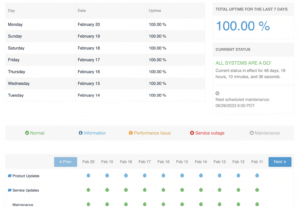
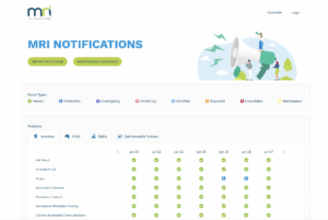
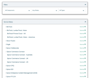
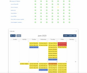
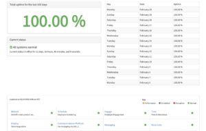
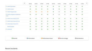
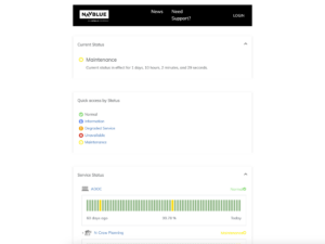
NAVBLUE provides an easy to view 60 day history lensed by viewing through Service Status, Events and Calendar. Single-click expand and collapse provides fast access to information.
NAVBLUE links out to external resources and provides links to news on the main NAVBLUE website as well as the support portal, making the status page seem very much an integrated part of its web presence.
#14 – SUPPORTING TRANSPARENCY
https://alliedsolutions.statuscast.com
Allied Solutions, LLC is a financial services business, providing value-added support to 4,000 B2B clients. A range of solutions include insurance, consumer lending, employee benefits and technology to improve the efficiency of lending operations.
What’s great about this page?
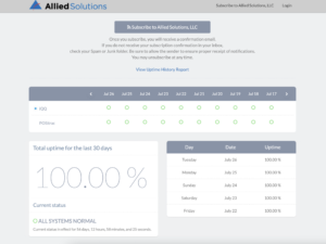
One of the key characteristics of the Allied Solutions status page is that it provides a detailed history of incidents.
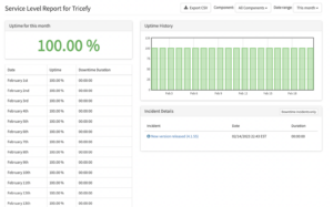
Clicking the ‘View Uptime History Report’ shows the uptime history and using the drop down date range contro you can see any period of week, month or year in the previous 2 years .
Putting such granular levels of detailed reporting right up front helps to demonstrate Allied Solutions attaches a great deal of importance to providing a high level of transparency.
What are the Benefits of a Status Page?
Status pages are necessary to deliver a top-notch customer experience and the benefits of using them are three-fold: they reduce support costs, build higher customer trust, and increase productivity. Before examining status page examples, let’s run through these essential advantages.
Lower Your Support Costs
There are many existing status pages you should draw inspiration from when building your own. One thing all status examples have in common is that they lower your support costs.
Whenever outages occur, the system aggregates relevant information from your application monitoring and other applications, to automatically update your status page to let users know what’s happening.
Keeping customers informed is the key to effectively managing downtime. With a status page in place, users can track the real-time system updates, either globally or specifically what affects them if they are a subscriber, and determine if their issue requires customer service action, helping reduce ticket volume for your team.
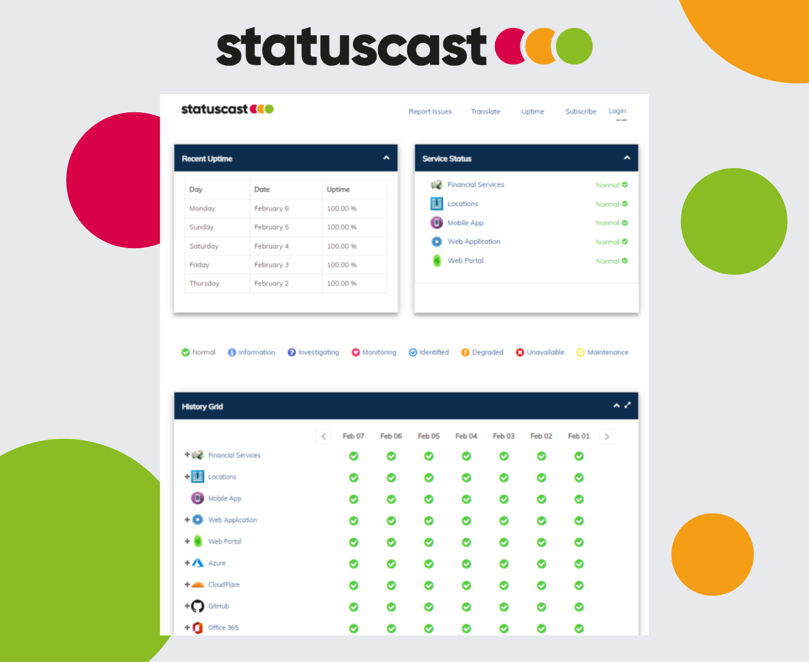
Of course, your status page must have a memorable URL for this to work. Most companies simply append “status” to their existing URL. For example, our status page is “status.statuscast.com.” But unlike many other status page providers, StatusCast supports custom urls to ensure consistent branding across all of your customer facing communications.
Higher Customer Trust
Once you’ve deployed your status page, either with a custom design or using our out-of-the-box status page template to build your page, you can communicate its existence to users. Trust building comes in by being transparent about upcoming and unexpected outages through this page.
More Productivity
Outages are disruptive enough for your teams. Not only are they unable to use their tools or access their workflows, customers are also limited in what they are able to do.
Using an incident reporting system for 24/7 monitoring and linking reports to your status page, allows you to spend less time devising reports, communicating with customers, and servicing incoming support tickets. Instead, your IT department can focus its resources on resolving the issue and getting your system back online.
What Makes for a Good IT Status Page?
A good IT status page is one that allows your end-users to quickly digest what is going on with your organization. This means (above all else) that if there is an ongoing event, whether it’s planned or not, that it’s easily identifiable. Ultimately status pages are a tool for creating organizational transparency, so if a page is burying the problem or sharing the issue in a cryptic format, then it’s not doing what it was meant to do from an end-user’s perspective. A single-source-of-truth, providing insight into all critical third party services, as well as internal systems, that tracks vital status page metrics like uptime and SLA data, with support for component subscriptions and audience segmentation - is the killer app for an effective incident response process.
The best status pages are constructed with simplicity in mind. Ongoing and previous events must be communicated using language everybody can understand. Remember, not everyone using your services will understand complex technical terms. All decent status page examples will communicate vital information in seconds to answer the primary question on a customer’s mind: “What’s going on?”
Your status page should provide a consistent experience in its design. Including branding throughout your status page is an excellent opportunity to continue your passive marketing efforts. It’s important to note that your branding efforts should not get in the way of status updates.
You may also want to include an extra avenue for contacting your customer support team for urgent issues. If your entire site is down, customers may be unable to pull up your contact details. Staying in touch with your customers throughout the process sends a powerful message. Some status page examples provide links to their Facebook or Twitter accounts for real-time updates.
Ultimately, all good examples of status pages include the tools customers need to get help, learn what’s going on with your service, and receive the latest information on the ongoing outage.

